MasterCard : Connect
Connect is a hub, a starting point for every workflow within the MasterCard framework. Each user’s dashboard is unique to them, providing quick access to the content and apps they need. It should help surface notifications of recent activity in messages; acting as a trigger to start separate workflows.
Through stakeholder interviews, extensive user testing on-site at St. Louis and rapid prototyping sessions, we were able to progress initial sketches to a clickable prototype ready for build in 10 weeks.
Goals
An evolution of the existing Connect Platform- Leverage collective knowledge and experience of the existing service and systems.
Prepare research methodology and carry out user interviews and observations
Deliver brand led assets to sustain future development
Support development teams within MC to ensure all design solutions are feasible, implementable and maintainable
Faster and easier to access apps and core functionality on multiple device types and browsers
2 Day Client Workshop
The team went onsite for 2 days. We wanted to redefine existing personas and design principles from Phase 1, identify user scenarios and have a good top-level framework.
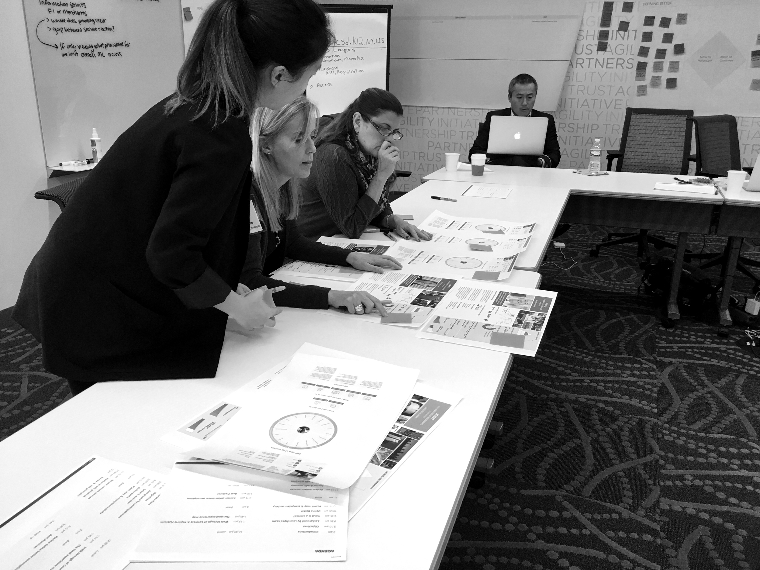
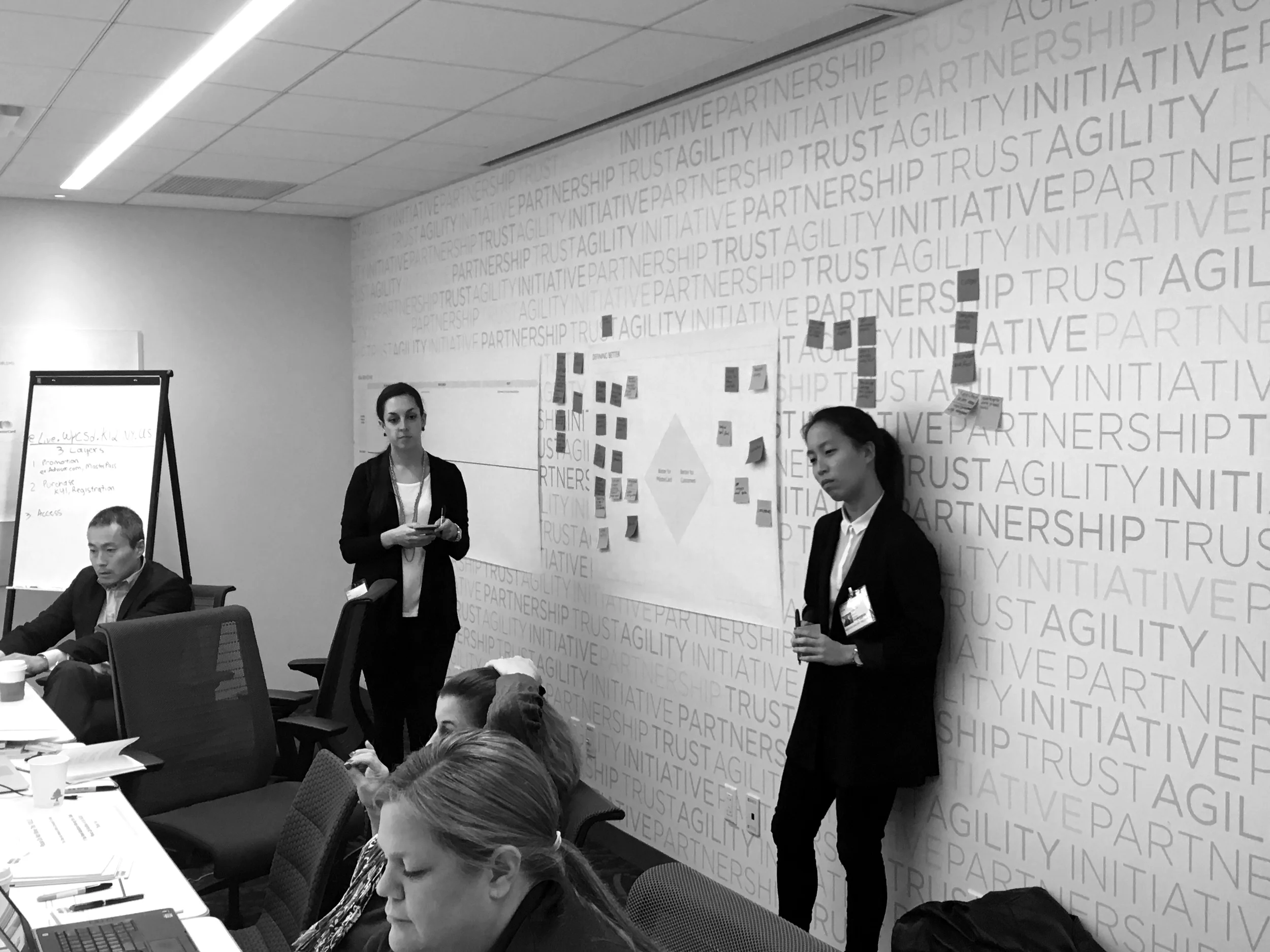
After meeting up with 6 MasterCard stakeholders, we identified the need and expectations for what Connect should be. By conducting activities such as 'Point Map' , 'Ecosystem map' and 'Define Better' we were able to dig up the pain points and prioritize the needs.
Design Iteration
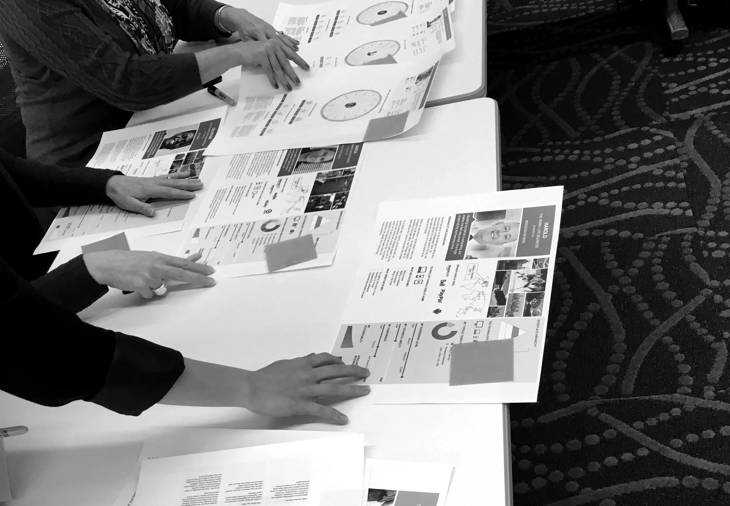
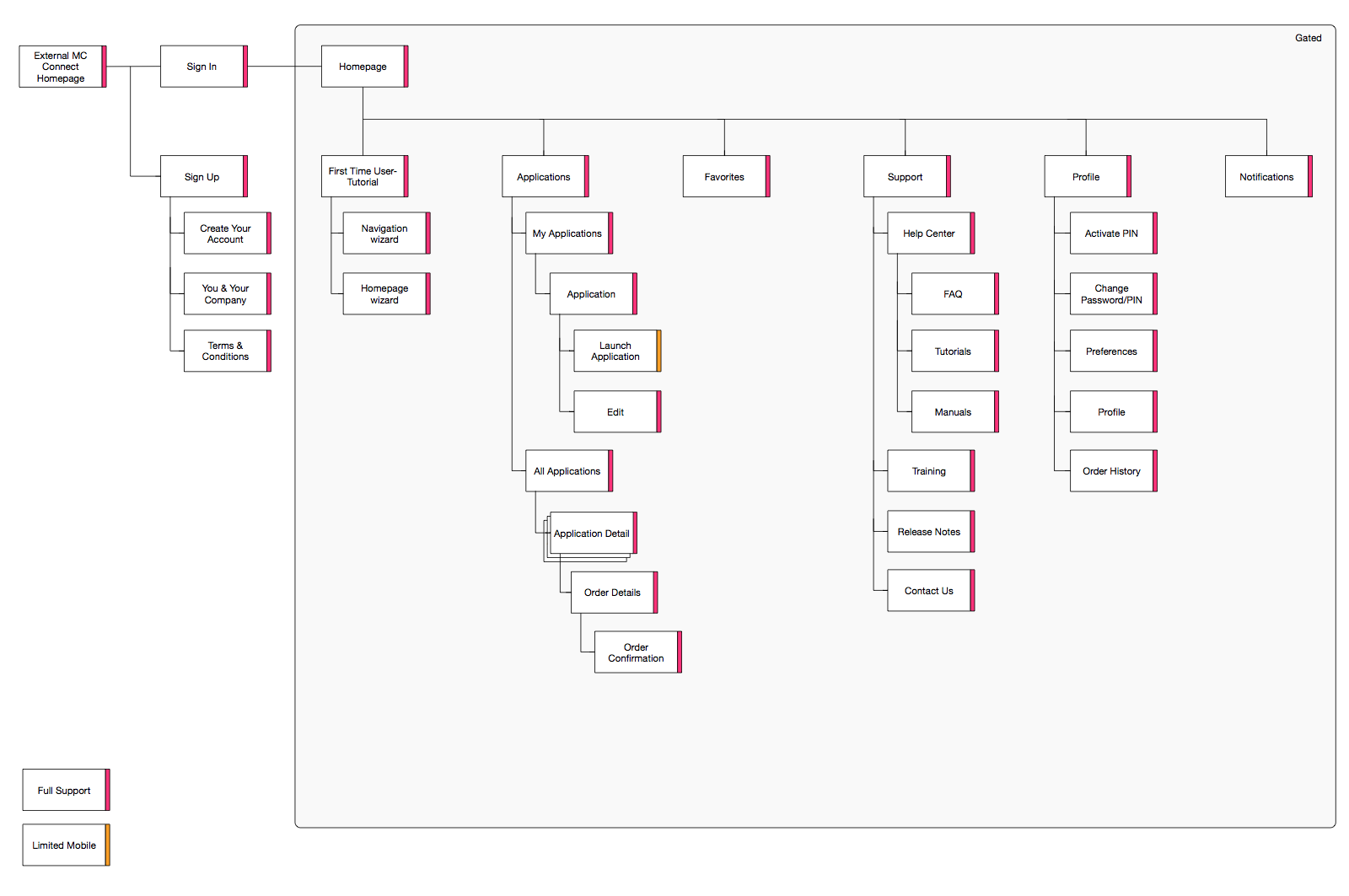
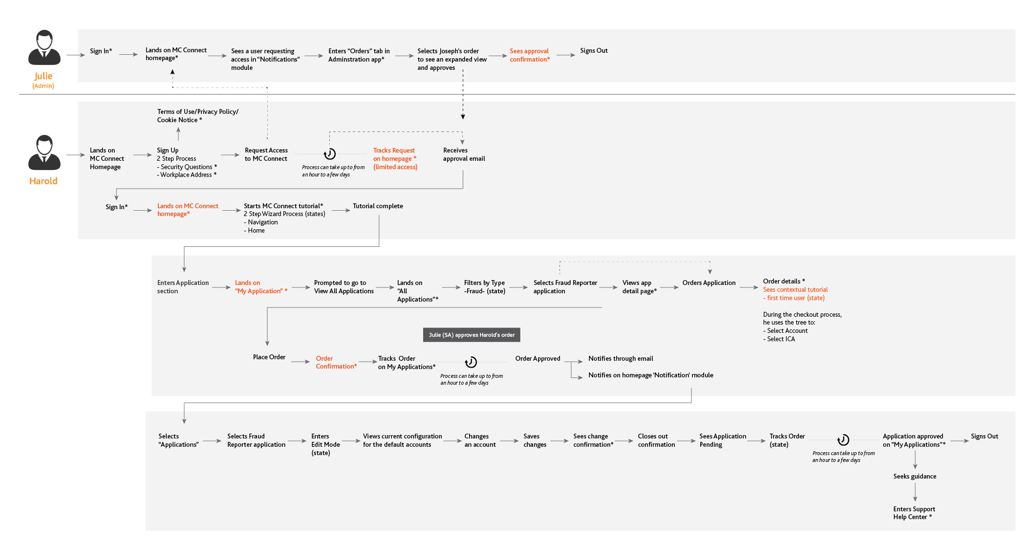
Looking back at the outtakes from the workshop, we prioritized the requirements and started to divide into multiple design sprints. This phase consisted of five sprints, ending each sprint with guerrilla user testing it validated our thoughts and designs. I created a sitemap, user flow, wireframes and UX pattern asset kit (documentation of re-usable components).
Userflow identifying the prototype storyline
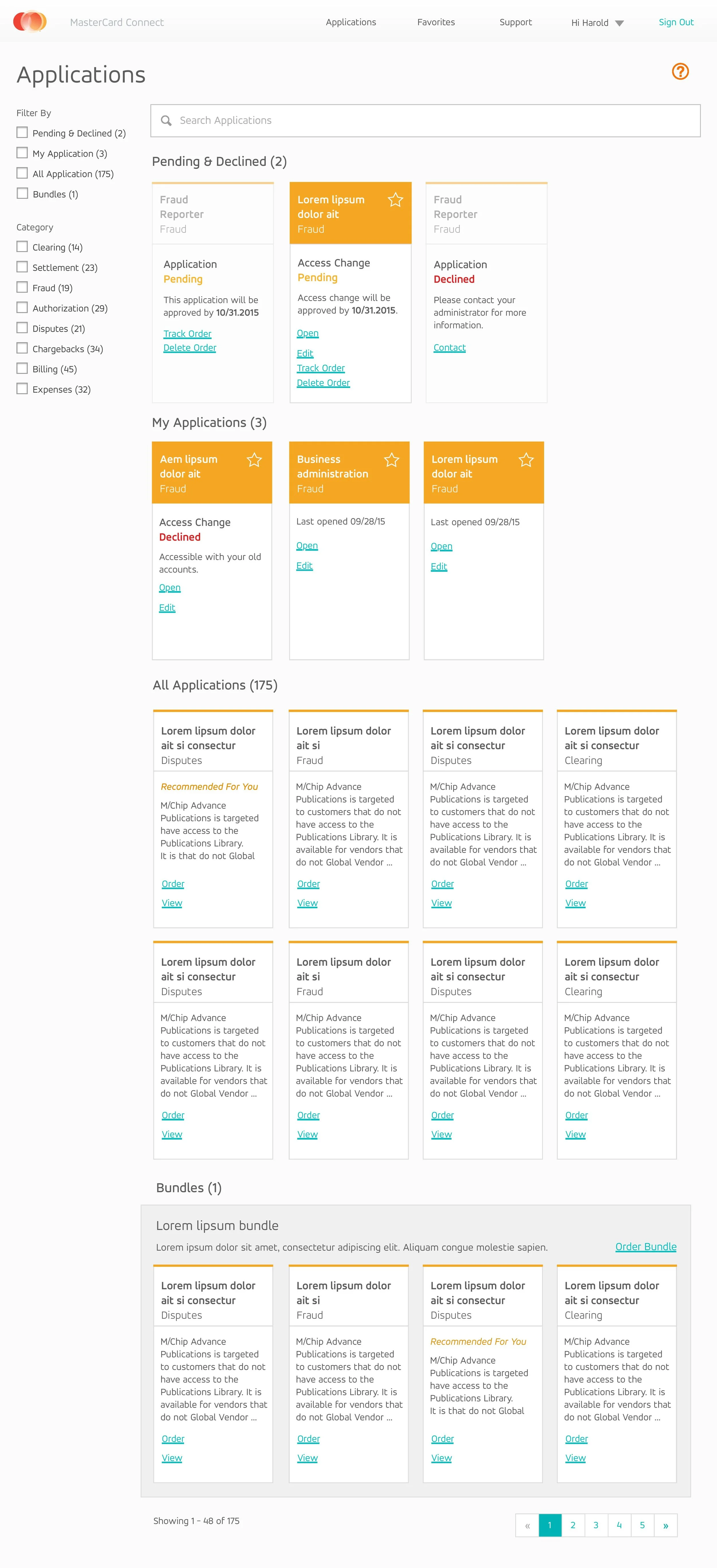
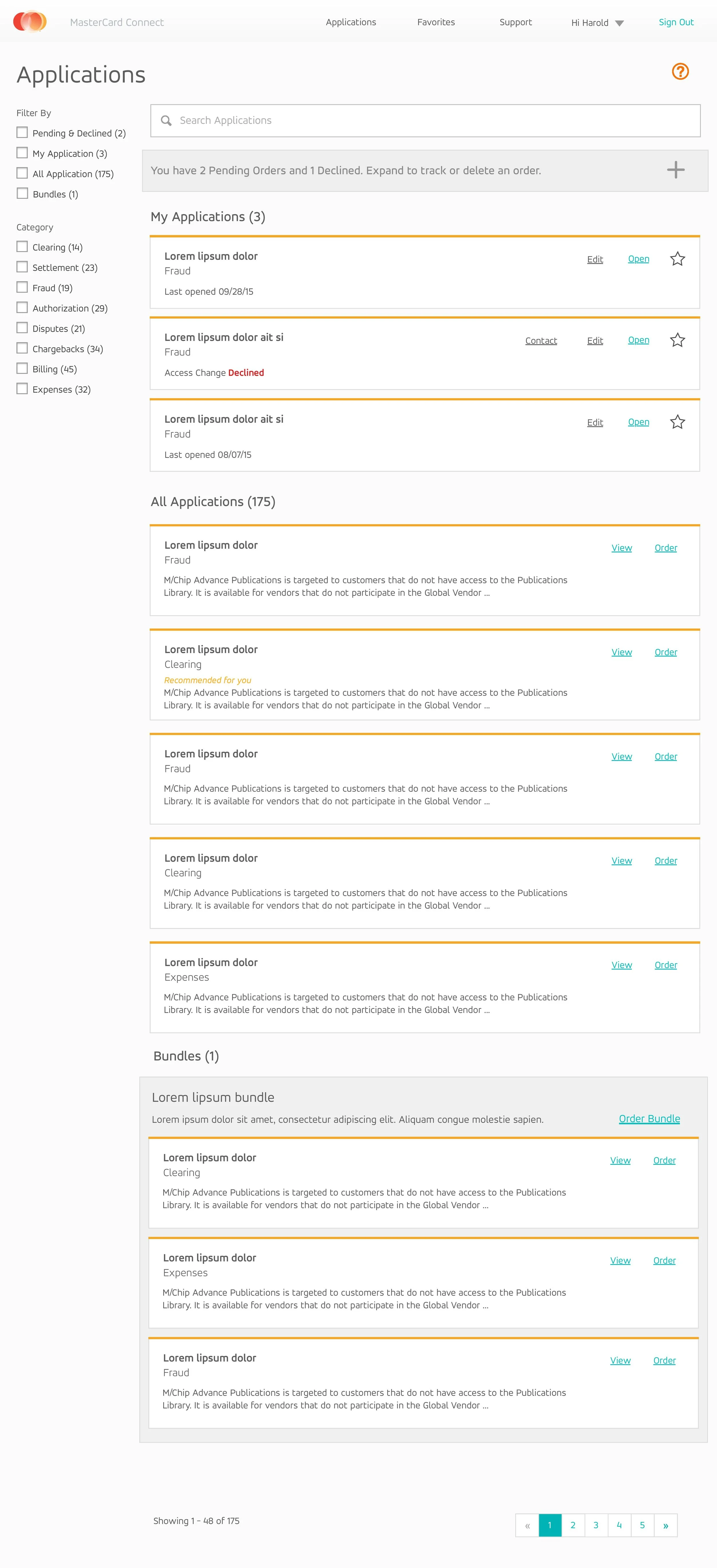
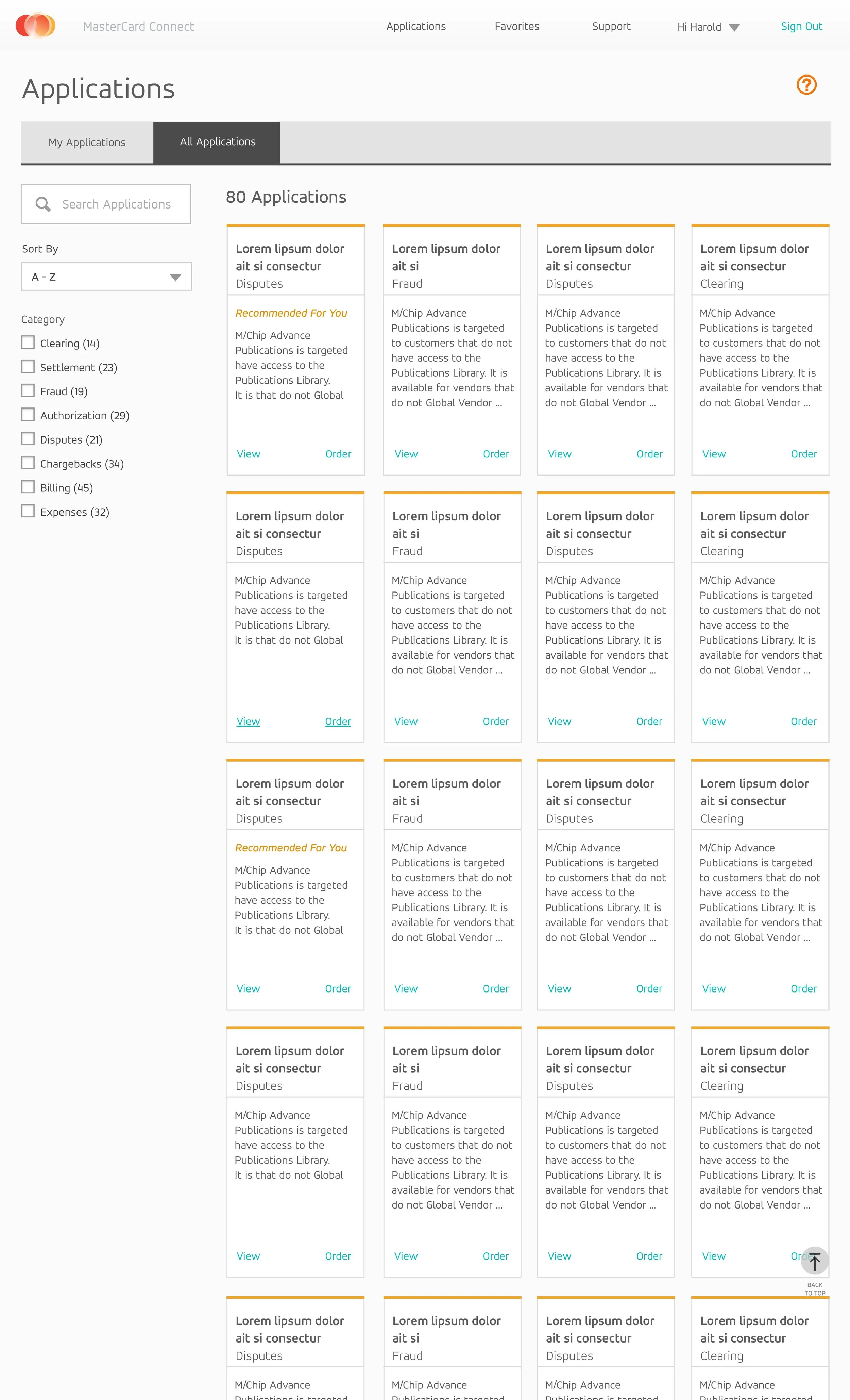
Applications Section Exploration through testing
For this particular section, there was a split in consensus of how this page was laid out and how the tile was designed. We conducted guerrilla AB testing using time on task for ease of use and scannability. These are some of our tested designs.

After our five sprints, we conducted a final user testing at MasterCard HQ with 6 new users going through the whole journey. Due to previous guerrilla testing there weren’t any red flags; for some minor issues, we made quick fixes with new solutions on-site.
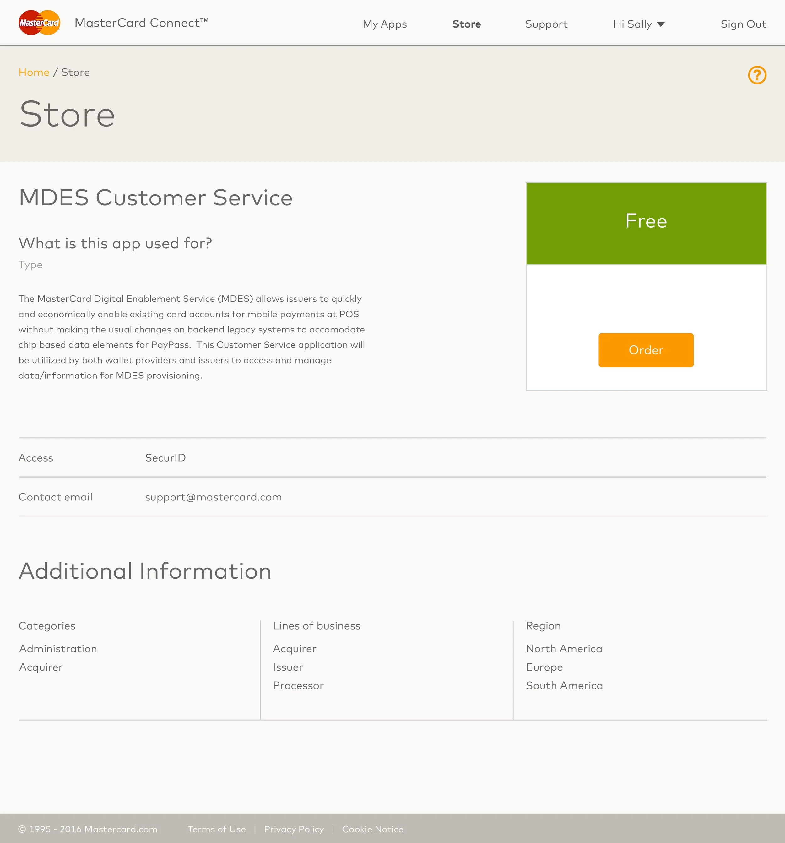
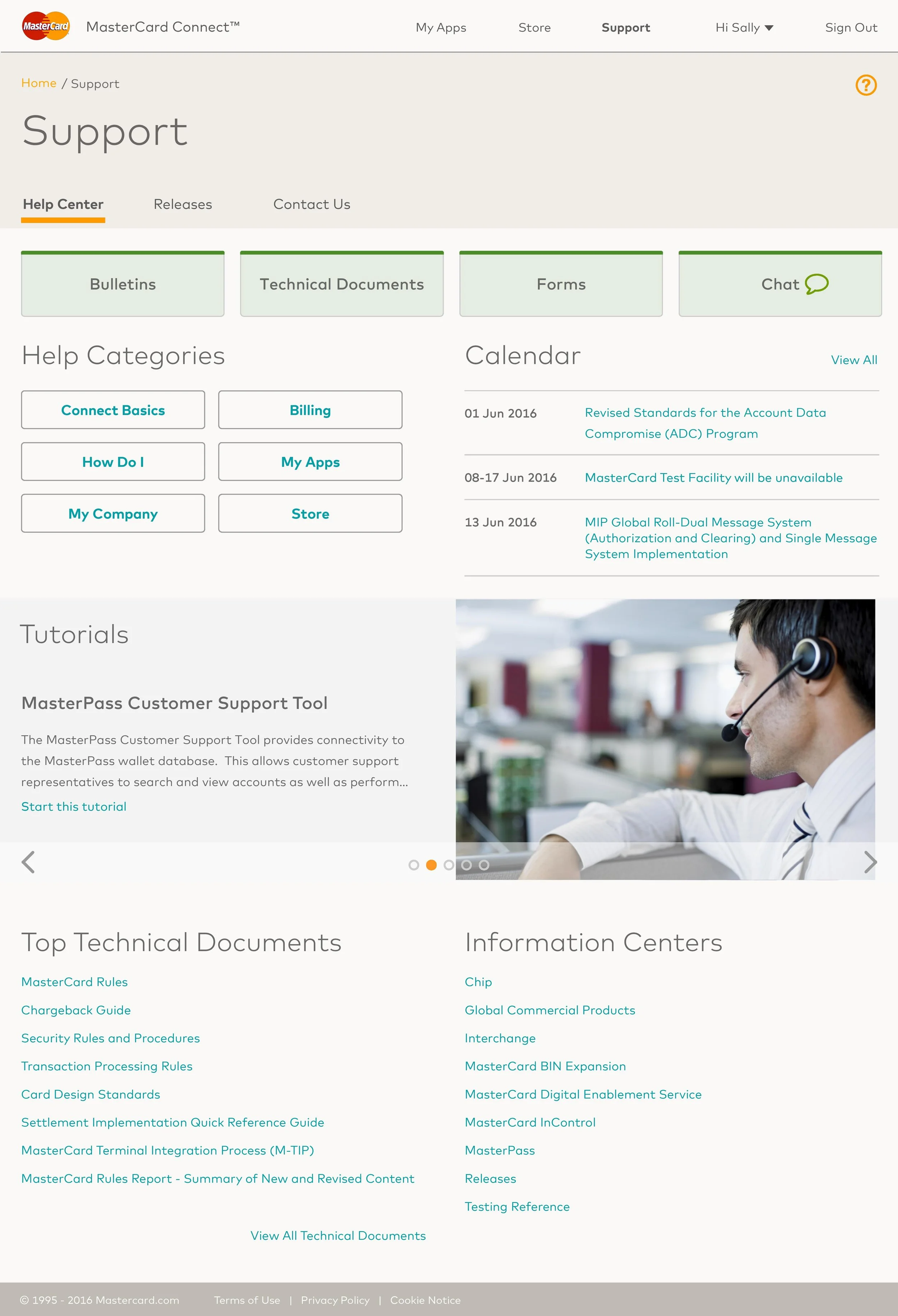
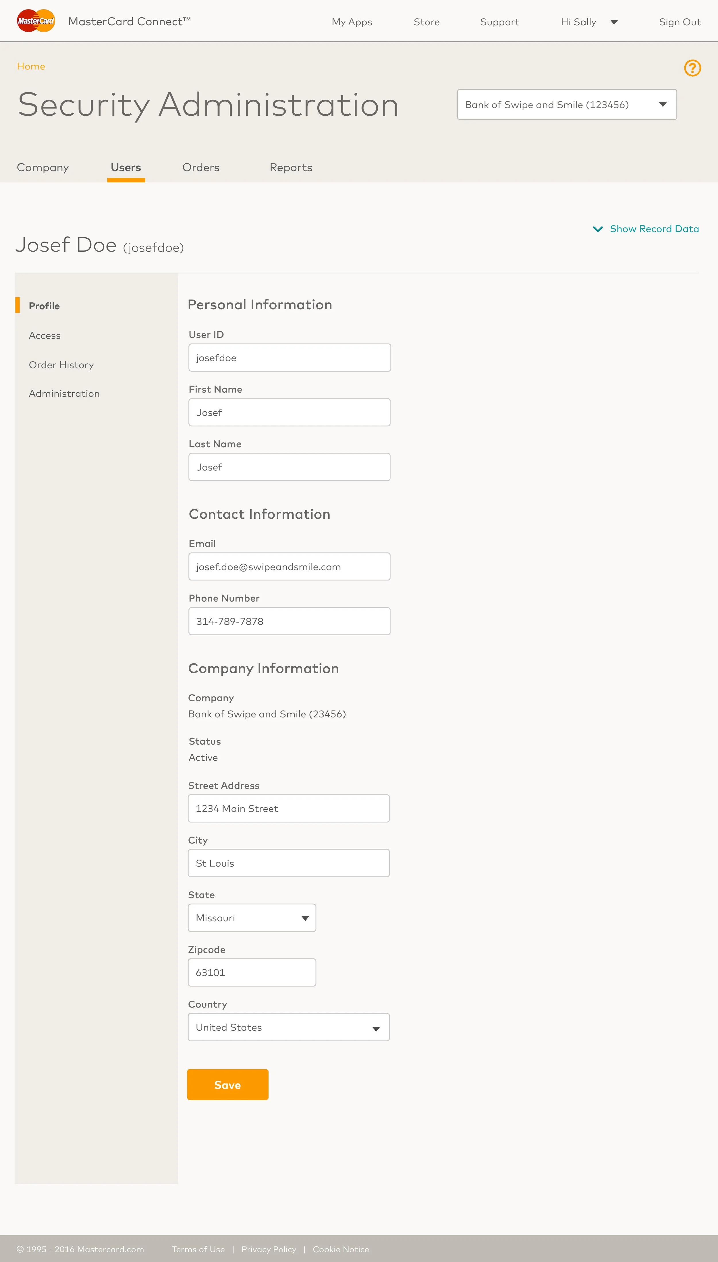
Here below are the final visual designs.